
Excel Dashboard for Beginners: A Step-by-Step Guide (No VBA Needed)
Thành Thái
4/27/2026
It's Monday morning. Your manager walks over and says: "Can you prepare a sales summary report by end of day?" You open Excel and stare at 500 rows of raw data — numbers everywhere, no structure, no visuals.
Sound familiar? This is exactly the problem a well-built Excel Dashboard solves. And the best part? You do NOT need to know VBA, macros, or any kind of coding to build one.
In this guide, we will walk you through how to build a professional, interactive Excel Dashboard from scratch — step by step — using only built-in Excel features. By the end, you will have a dynamic report that updates with one click and impresses anyone who sees it.
What Is an Excel Dashboard?
An Excel Dashboard is a single-page visual summary of your data. Instead of scrolling through hundreds of rows, a dashboard shows you the key metrics — total sales, top products, monthly trends — all in one place, with interactive charts and filters.
Think of it as the "cockpit" of your data. You see everything that matters at a glance.
A great dashboard has three things:
A clean visual layout with charts and KPI cards
Interactive filters (called Slicers) that let you drill down into the data
A one-click refresh system so it always shows the latest numbers
💡 Note: A Dashboard is NOT the same as a regular spreadsheet or report. A report shows raw data. A dashboard tells a story with that data.
What You Need Before Starting
Good news — the requirements are minimal:
Microsoft Excel 2016 or later (Microsoft 365 recommended)
A dataset with clear column headers — no merged cells, no blank rows in the middle
About 30 minutes of your time
Zero coding knowledge required
For this tutorial, we will use a sample Sales dataset with columns: Date, Product, Region, Salesperson, and Amount.
Step-by-Step: Build Your Dashboard in 5 Steps
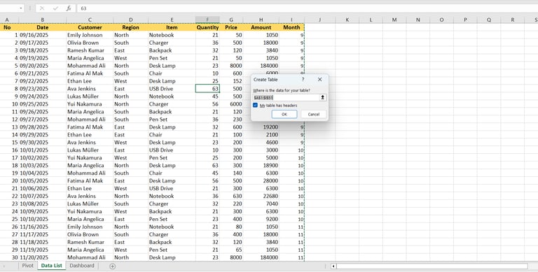
Step 1: Organize Your Raw Data
Before building anything, your data needs to be clean and structured. Place all your raw data in a dedicated sheet — name it "Data" to keep things organized.
Then, convert your data into an official Excel Table:
Click anywhere inside your data range
Press Ctrl + T
Make sure "My table has headers" is checked, then click OK
Why does this matter? An Excel Table automatically expands when you add new rows. Your Pivot Table and charts will pick up the new data automatically — no manual range updates needed.
⚠️ Critical: Never use merged cells in your data sheet. Merged cells break Pivot Tables and cause confusing errors.
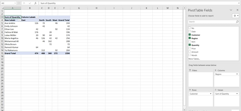
Step 2: Create a Pivot Table
A Pivot Table is the engine behind your dashboard. It summarizes your raw data automatically and powers all the charts.
Here is how to create one:
Click anywhere inside your Table on the Data sheet
Go to Insert → PivotTable
Choose "New Worksheet" and click OK
Name this new sheet "Pivot"
Now build your summary in the PivotTable Fields panel on the right:
Drag "Date" to the Rows area (group by Month if needed)
Drag "Product" to the Columns area
Drag "Amount" to the Values area (set to Sum)
Repeat this process to create 2 or 3 different Pivot Tables — one for monthly trends, one for regional breakdown, one for top products. Each will power a separate chart on your dashboard.
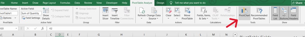
Step 3: Insert Charts from Your Pivot Tables
Now we turn those Pivot Tables into visual charts. Click anywhere inside a Pivot Table, then go to Insert → PivotChart. Choose your chart type:
Bar Chart — best for comparing categories (e.g., sales by product)
Line Chart — best for showing trends over time (e.g., monthly revenue)
Donut or Pie Chart — best for showing proportions (e.g., regional share)
After inserting the chart, clean it up: remove the chart title placeholder, delete the legend if it's not needed, and simplify the axis labels. Less clutter = more professional.
💡 Pro Tip: Right-click on a chart element (gridlines, background) and select "Delete" to get a clean, minimal look.
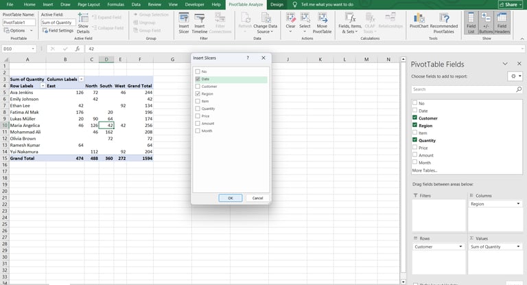
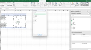
Step 4: Add Slicers for Interactivity
This is where the magic happens. Slicers are visual filter buttons that let you click to filter your entire dashboard — no formulas, no VBA, no coding.
To add a Slicer:
Click on any Pivot Table
Go to PivotTable Analyze → Insert Slicer
Check the fields you want to filter by (e.g., Region, Product, Month)
Click OK — the Slicer buttons will appear on screen
If you have multiple Pivot Tables that should respond to the same Slicer, right-click the Slicer → "Report Connections" → check all the Pivot Tables you want it to control.
Now when someone clicks "North" on the Region slicer, every chart on your dashboard instantly updates to show only North Region data. No VBA required.
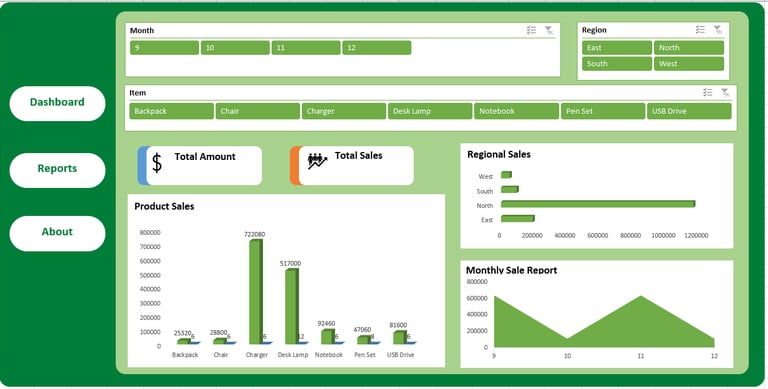
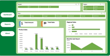
Step 5: Arrange Everything on Your Dashboard Sheet
Create a brand new sheet and name it "Dashboard". This is your final presentation layer.
Move all your charts and slicers to this sheet:
Right-click each chart → Move Chart → select "Dashboard" sheet
Cut and paste each Slicer to the Dashboard sheet
Arrange them in a logical layout: KPI numbers at the top, charts in the middle, slicers on the left or top
Final polish steps:
Go to View → uncheck Gridlines and Headings for a clean look
Use a consistent color theme (2–3 colors maximum)
Hide the Data and Pivot sheets: right-click sheet tab → Hide
Add a title text box at the top with the dashboard name and date
Pro Tips for a Dashboard That Looks 10x Better
These small details make a huge difference in how professional your dashboard looks:
Stick to 2–3 colors max — use your company's brand colors if possible
Use one consistent font throughout (Calibri or Segoe UI work well)
Align all charts and elements using Excel's Align tools (Format → Align)
Add a "Last Updated:" cell that shows today's date so readers know the data is fresh
Protect the Dashboard sheet (Review → Protect Sheet) so users can only click Slicers, not accidentally edit charts
💡 The "Refresh All" button: Every time you add new data to the Data sheet, go to Data → Refresh All. All your Pivot Tables and charts will update instantly.
Frequently Asked Questions
Q: Does this work on Mac?
A: Yes. Pivot Tables and Slicers work on Excel for Mac (2016 and later). The steps are almost identical — the menu names are the same.
Q: What if my data changes every month?
A: Just paste your new data into the Data sheet (keep the same column structure), then go to Data → Refresh All. Every chart updates in seconds.
Q: Can I share this dashboard with someone who doesn't have Excel?
A: Yes. Save the file and send it — they just need Excel 2016 or later to interact with the Slicers. You can also export it as a PDF for a static snapshot.
Q: What if I have more than 10,000 rows of data?
A: Pivot Tables handle large datasets very well. For extremely large data (100k+ rows), consider using Power Query to load data from an external source for best performance.
Ready to Skip the Setup?
Building a dashboard from scratch is a great skill to have — but it takes time to set up correctly. If you want a head start, we have done all the heavy lifting for you.
Our free Non-VBA Excel Dashboard Template comes pre-built with Pivot Tables, Slicers, and a professional layout ready to go. Just paste in your data, click Refresh All, and your dashboard is ready in minutes.
Download the Free Template at: smartsheetlab.com/excel-templates
Want to see it in action first? Watch our step-by-step video tutorial on our YouTube channel: youtube.com/@BrainPlay_No1
Product
© 2026. All rights reserved.