
Pivot Table Masterclass: From Raw Data to Executive Report
Thành Thái
4/10/2026
1. The "Clean Lab" Rule: Prepare Your Data
Before you click "Insert," your data must follow three strict rules:
No Empty Rows/Columns: Your data must be a solid block.
Unique Headers: Every column must have a name (e.g., Date, Region, Sales).
No Subtotals: Remove any manual totals you’ve added; the Pivot Table will do that for you.
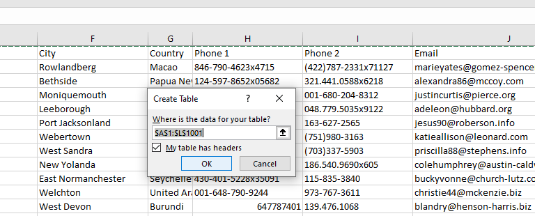
Pro Tip: Press Ctrl + T to turn your data into an official Excel Table first. This ensures that when you add new data tomorrow, your Pivot Table updates automatically.
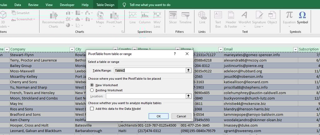
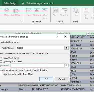
2. Creating the "Laboratory" Framework
Click anywhere in your table.
Go to Insert > PivotTable.
Choose New Worksheet and click OK.
You now have a blank canvas on the left and the PivotTable Fields list on the right. This is where the magic happens.
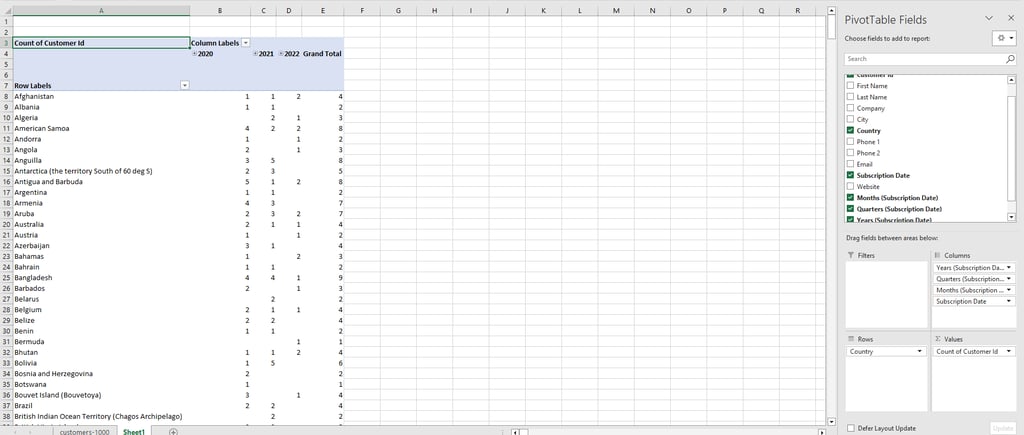
3. The 4-Zone Strategy
Think of the Pivot Table Fields as four "Zones" where you drop your data:
Values: Drop your "Numbers" here (e.g., Sales, Profit, Customer ID). Excel will automatically sum/count them up.
Rows: Drop your "Categories" here (e.g., Product Names or Customer ID). This creates your vertical list.
Columns: Use this for "Time" or "Comparison" (e.g., Years or City).
Filters: Drop anything you want to "Sift" through (e.g., Company).
[Image: A clear diagram showing the 4 zones of the PivotTable Fields list]
4. Turning Data into an "Executive" Report
Executives don't want to see every transaction. They want Insights.
Group by Date: Right-click any date in your Pivot Table and select Group. Choose "Months" and "Years." Instantly, 50,000 rows become a clean monthly trend.
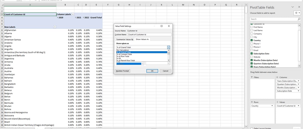
Show Values As %: Want to know which region contributed most? Right-click a Sales number > Show Values As > % of Grand Total.
Sort for Impact: Right-click your largest sales figure and select Sort > Largest to Smallest. Put your best performers at the top!
5. Adding the "Lab" Polish (Slicers & Design)
To make it look like a "Report" and not just a "Table":
Go to the Design Tab and choose a professional color theme (avoid the bright neon colors).
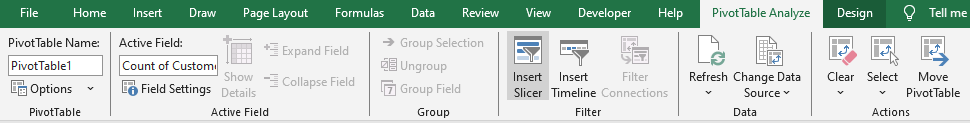
Go to PivotTable Analyze > Insert Slicer. Select "City."
Now, your executive can click any city and watch the entire report update instantly.
Final Lab Report
A Pivot Table is the closest thing to "Magic" in the professional world. It takes the chaos of raw data and organizes it into a story. By mastering this one tool, you save yourself hours of manual calculation and provide value that gets noticed by leadership.
Product
© 2026. All rights reserved.